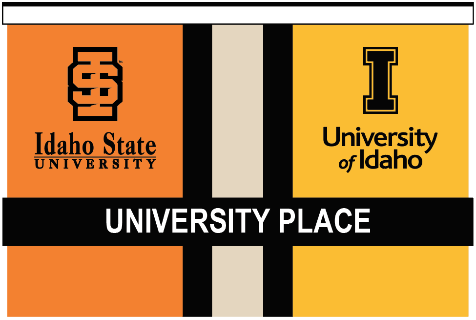
In Idaho Falls, University of Idaho and Idaho State University share a campus. The sign by the entrance is old and out-dated. This was an attempt to refresh the sign while keeping branding standards for both schools.

- Issues with the original sign:
- Broken plastic parts of Idaho State University
- Branding for both universities is outdated
- No one uses “University Place” anymore
- Both universities use “Idaho Falls” in location name, but it is obscured
- university names are not memorable in this configuration
- Idaho State University seems more prominent as it is above
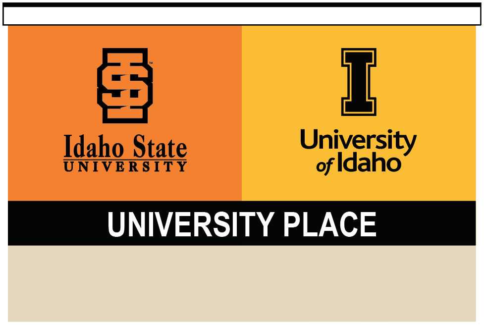
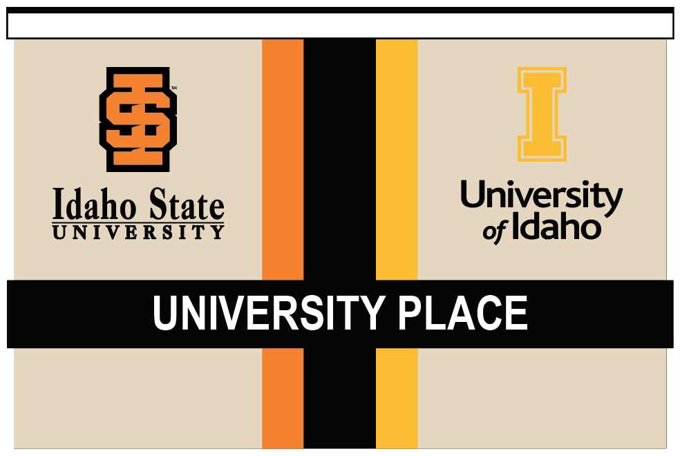
Simple is best. It was determined that the existing stucco matches the other architecture on campus. So, we’re going to simplify the design. Also, this was the point when it was decided to drop “University Place” because no one uses it.
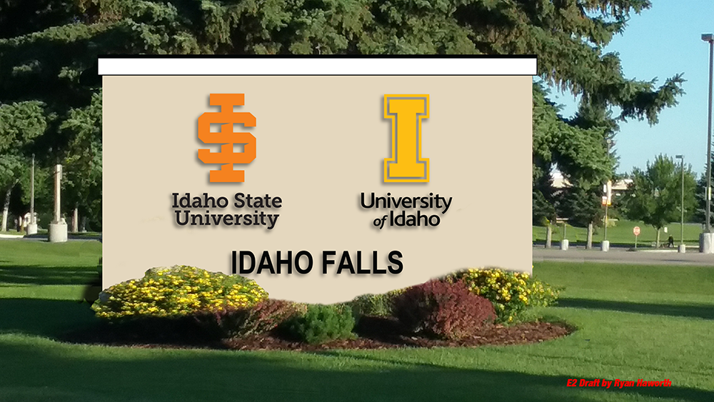
So the final will be the one just below.